Design Minimalism and Why Instagram's Logo Will Never Go Away
Trends can inspire brands to revamp their image or perhaps be a burden to implement change. But, any update, big or small, can help transform a brand to become more modern and easily recognisable. For instance, the emergence of wearables in the technology world has brought the notion that brands need to simplify so they can be recognised on even the smallest of screens, such as the Apple Watch.Minimalism has been trending for a few years. Whether it’s what we’re wearing or how we’re advertising, we’ve been cutting the superfluous to focus on our strengths.

With brands, minimalism was brought into the spotlight when, in September 2015, Google opted for a logo sans serif. They retained their signature order of colours with blue, red, yellow, and green and, although shocking at first encounter, as most changes are, the logo is now commonplace as we use the search engine on a daily basis.

Yahoo had a similar change in 2013. They, too, went for sans serif, but included a 3D-like shading to make the logo pop. Cleverly, the brand decided to release a new logo every day for an entire month before the final logo launched, giving the public time to adjust to the changes and give feedback, although each retained the signature purple colour and exclamation point.

The most recent big brand to make the switch was Instagram and the logo debuted in early May. Retaining their iconic Polaroid camera outline, the social media network ditched the brown and rainbow to a simple white outline of the camera with a blue, yellow, and pink ombre background. While the public seem to be 50/50 with their approval, each of the Instagram products made the switch, helping to unify the brand.

OpenTable also made the change to a more minimalist design in 2014. With their redesign they also changed their brand colours. Originally a sea foam green and a red wine colour, they opted for red as, psychologically, it can increase appetite for the app users. This use of red is seen in many food-related service apps such as Hungry House and Seamless.

Here at Digity, we also made a transformation. Our previous logo featured a red gradient with a white "d" along with our full "Digity" in grey. Tuning into the trends of many social media sites such as Facebook, Tumblr, and Twitter, we opted for a solid red box and a simplified, all-white logo inside. With this, we are able to retain consistency whether our logo is at the top of a computer screen or seen in the tiny profile box on Instagram and Twitter.

The secret to a successful logo change often lies in the reason for the change. If it’s because your logo evokes something abhorrent then, arguably, any change is welcomed. ISIS Mobile Wallet, for instance, went through a rebrand in 2014 in order to distance itself from any association with the extremist group of the same name. The new name of the brand, Softcard, which has since sold its assets to Google, along with bright colours and minimalist design was certainly more preferred by the public.

When change is for the sake of business, like Instagram’s, then the public seem to believe they can undo it as they explain what about the logo in particular they don’t like. While it’s unlikely that Instagram will ever revert back, some companies have. Gap, notorious for their 30-year old logo with simple all-caps white text on a navy blue background, attempted to modernise in 2010. They retained the navy blue but added a gradient and also opted for Helvetica in lieu of their iconic font. In less than a week fans on social media gave their harsh feedback, causing the company to forever relegate the new logo to a box in a dark room never to be seen again.
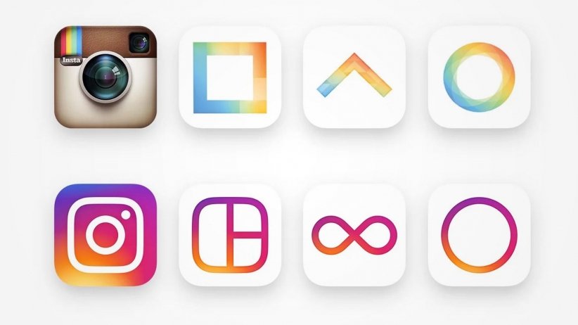
Instagram head of design Ian Spalter explained that, when coming up with the new logo, he asked employees to draw the logo from memory in just ten seconds in order to see what really stuck. His team took those elements to create the new logo, knowing it will be recognisable to the majority of users despite the drastic change. What also helped was transforming Instagram’s other products’ design, all which match this current version, before taking the plunge. This got many users used to the new layout, complete with an all white background and simple black icons and text, to make the reveal less of a shock.

Change can
be difficult. Imagine if someone unlocked your phone and rearranged all of your
apps. Better yet, imagine if a crafty intruder broke in and only moved around
the contents of your kitchen drawers. The worst thing that happens is you have
a brief moment of confusion and you carry on. Instagram isn’t worried about
losing users due to the logo change in the same way you won’t forgo cutlery due
to a change in kitchen organisation.
What
changes in logos have you seen in the past few years that may determine a
trend? Have you liked them?
This blog post was written by:
Join Our Mailing List
Find out more: