Is your Website Mobile Friendly, Optimised or Responsive, and Why it Matters
Having a mobile friendly site just isn’t enough anymore! In 2018, 52.2% of all worldwide online traffic was generated through mobile phones ( Statistica ), meaning you really need to be on top of the latest mobile technicalities. Mobile is taking over, so make sure your business is catering for this huge percentage of audience ready to digest your mobile content.Do you know how much of your own audience are on mobile? Is mobile driving up your bounce rate? Learn how to check for yourself. Laptops, desktops, tablets, mobiles and an array of ‘inbetweens’ mean your site could be shown on any size and shape imaginable. Mobile friendly websites, mobile optimised websites and responsive websites all cope in different ways to different screen shapes, so we’ve outlined the main differences below.
Mobile FriendlyA mobile friendly design is the minimum that the Google algorithm considers acceptable. Anything less will be chucked nearer the bottom of the Google rankings pile, making your site harder to find for potential customers (and remember, 90% of people don’t go past page 1 of Google search results).
How to develop effective search engine rankings
Most mobile friendly sites are often simply a slimmed down version of the desktop version. They are functional on a handheld phone, with CTAs that can be triggered by phone (phone numbers/email addresses/maps) however may not work perfect on any size screen such as tablets.

Mobile OptimisedMobile optimised websites are far more advanced. They have been designed specifically for a smaller screen, so the layout can be completely different to the desktop version, and can be optimised specifically to make the mobile journey easier to navigate.Mobile optimised websites usually have a single column layout, formatted (and often less) text for maximum readability and include more clickable buttons, replacing the need to type. Image sizes are smaller to ensure the loading time is quicker, decreasing bounce rates.
Are bounce rates affecting your Google rankings?
Mobile optimised sites aim to make the journey as efficient and engaging as possible, targeting people who are seeking a quick answer. However, they have been manually designed to work on a mobile screen, whereas responsive design does this automatically for any screen type the site is displayed on.
Responsive Design
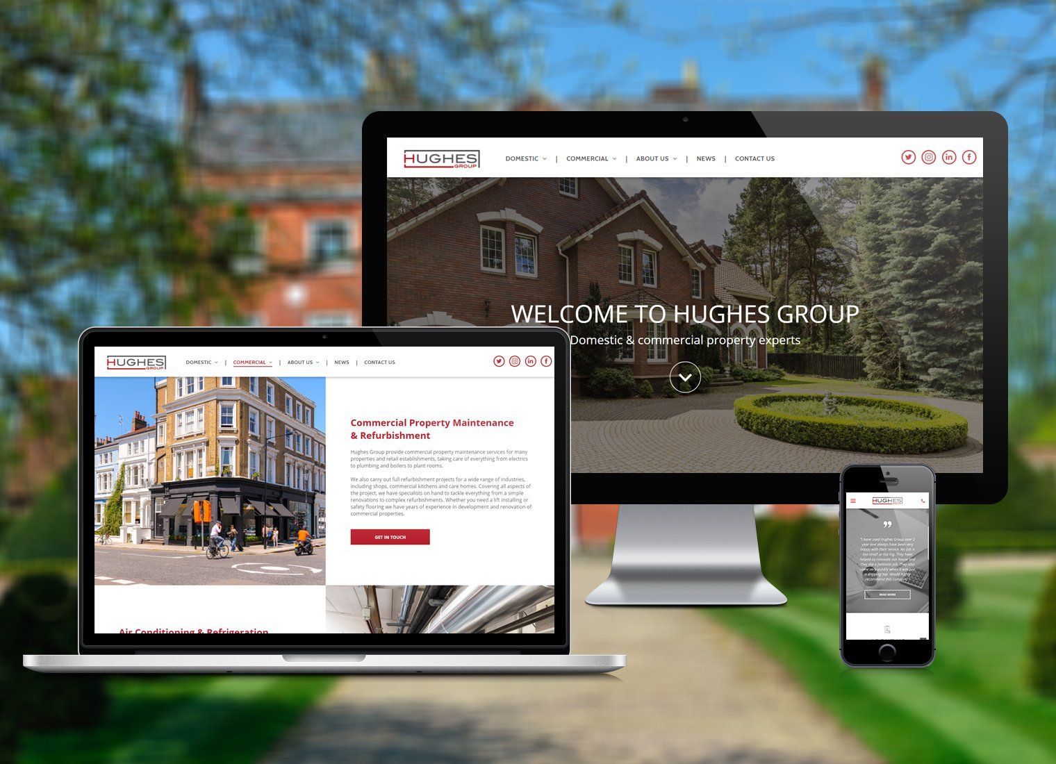
Responsive websites - the creme de la creme of websites. Responsive websites do exactly as you would expect. They automatically respond to any device, regardless of size or shape. The reforming and restructuring of the site is very flexible and exhibits great usability on all devices to guarantee your site looks great wherever it is displayed.
How to optimise your website to increase lead conversion
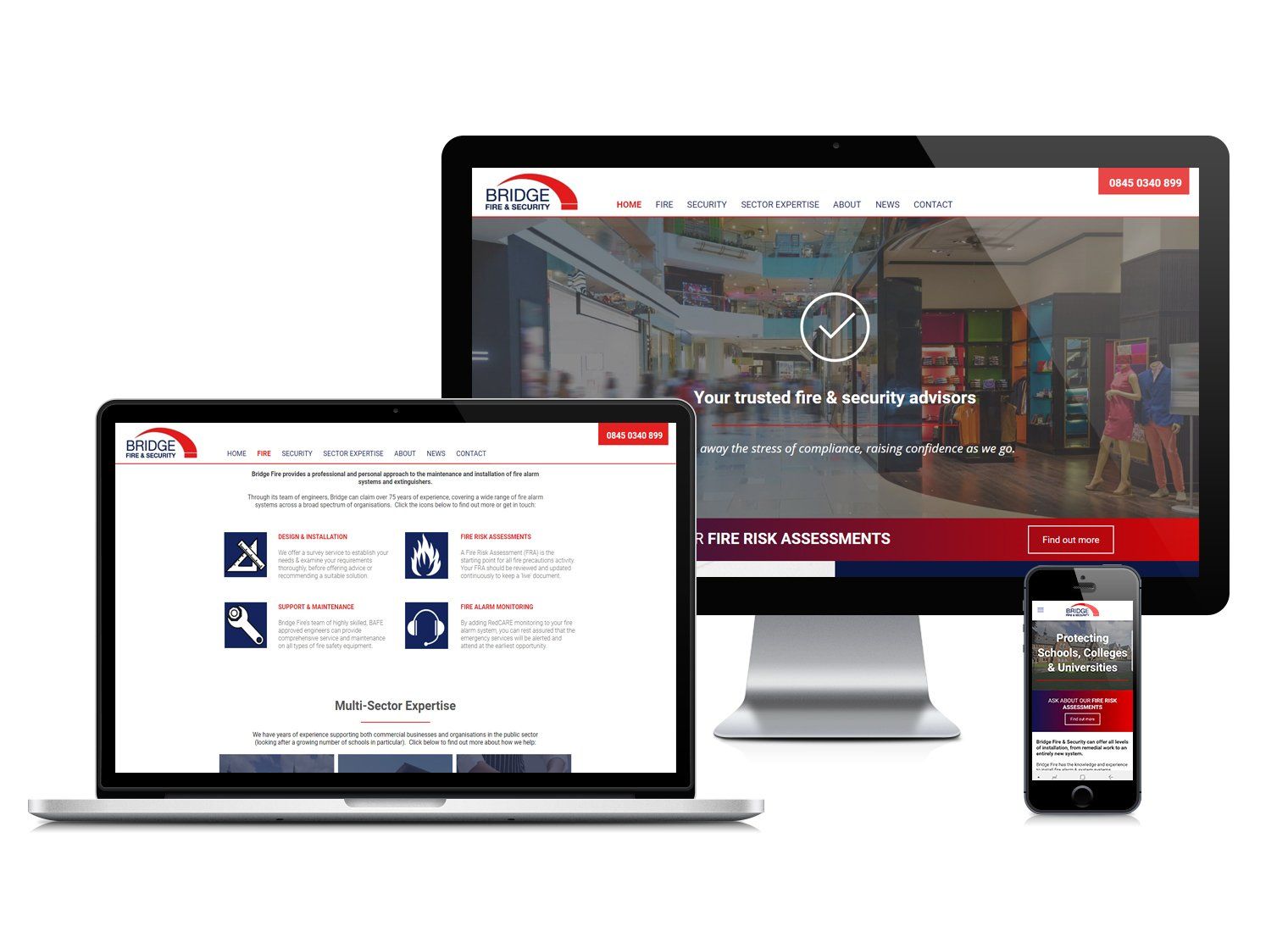
Mobile responsive design allows you to be more imaginative and intelligent with your website aesthetic and structure, and gives your customers more freedom to use the host of interface options that are only available through mobile. Responsive design is the preferred choice of Google, and rewards businesses who have optimised their websites with higher search engine result page (SERP) rankings.At Digity we create websites that are completely responsive, and consider carefully the changes we make on each platform to ensure the site is adapted and targeted flawlessly for encouraging customer relationships and conversions on any device. Give us a call on 01189 100 012, or book a free consultation online to discuss how we could transform your website to ensure it’s ranking higher on Google and displaying perfectly on every device, contributing to business success and development.
This blog post was written by:
Got a question?
Send us a message:
Contact Us
or book an intro. call:
All responses are handled in line with our Privacy Policy.