Logo Colours - Why Are They Important?

When it comes to designing logos, arguably one of the most important aspects is the colour choice. This will change how a consumer feels about any particular brand, and they will subconsciously categorise it based on the colour. To make sure your brand’s logo stands out from the crowd, it's key to use appropriate colours which differ from the competition.
Colour has a very integral link to emotion and we instinctively link certain colours with feelings. For example, in western culture, blue tends to be associated with calmness, professionalism and integrity. This makes it a highly popular choice, especially for more corporate brands who want to exude a feeling of calm authority without being intimidating. Green is seen to promote growth, freshness, nature and health. Green and blue are often used together in the health industry. Many logos for dentists, physiotherapists, health services and also science and environmental companies will use one or a combination of these colours.

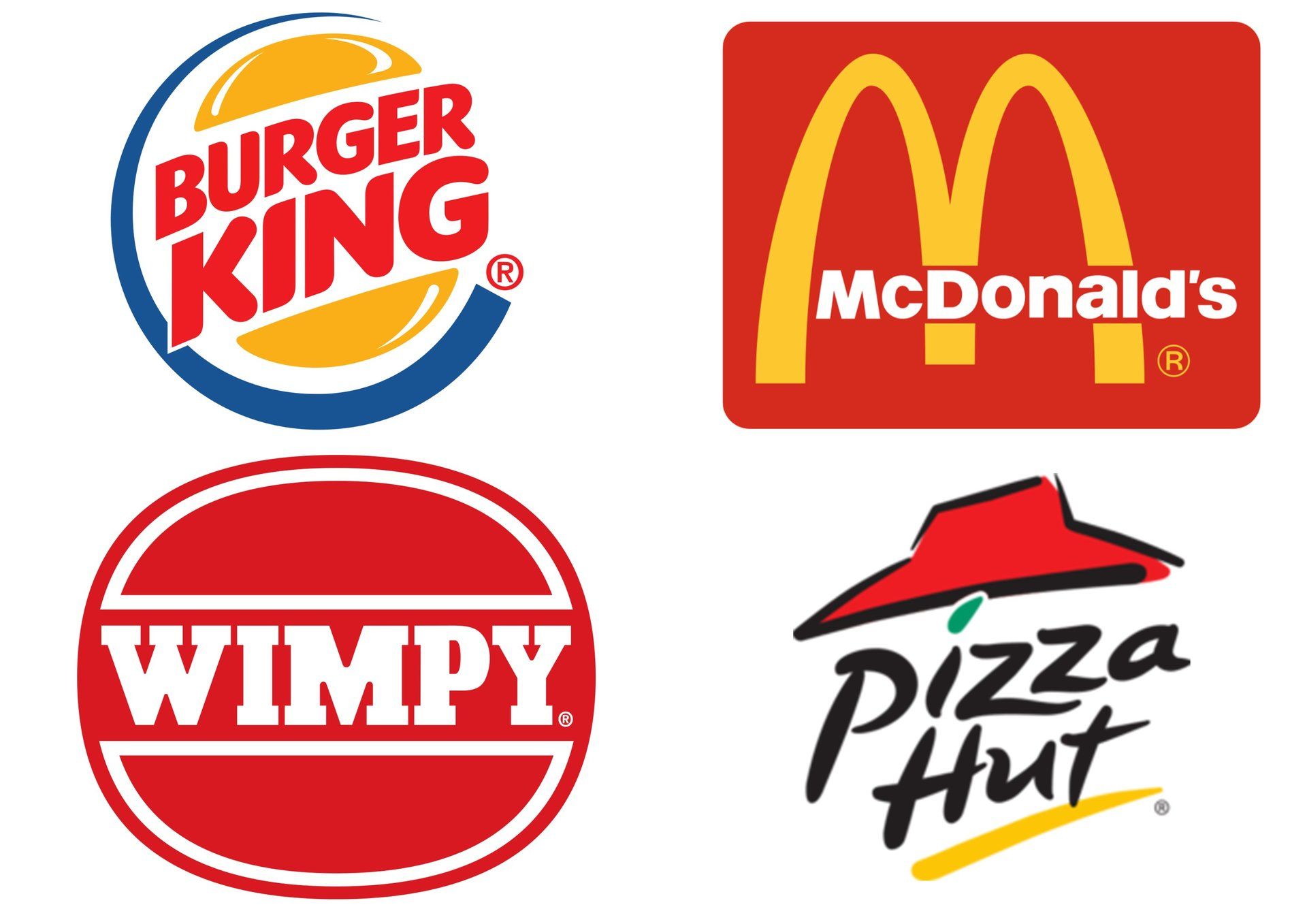
You may notice that many fast food restaurants use the colour combination of red and yellow. This is not an accident - research has found that the colour red makes you feel hungrier than other colours, hence the use in restaurants, while the yellow stands out and is even claimed to quicken metabolisms. It is deeper thinking into colour like this that can extend a logo from being purely visual to having a deeper connection with consumers and making it stand out from the crowd.
Another aspect to be considered when choosing brand colours is the varying cultural significance. A colour association in western culture may be completely different in the east. If a brand is going to be international and hope to grow to a global scale, this is something that should be considered so it doesn’t cause any negative associations. For example, although black can be seen to be more of a negative colour in many cultures, in the middle east it symbolises rebirth. Where red is more about warmth and anger in many western cultures, in China it is a lucky colour.
With all of these considerations, it is also important to consider the market competition. Yes, blue will exude professionalism and neutrality, but also what will make your blue stand out from everyone else's? This is where choosing another colour to make the combination stand out comes in, or choosing a different colour which still represents your brand values. Domino’s is a good example of this - in a fast food world of red and yellow, they have gone for red and blue, making their brand stand out visually from the rest.

So, when designing a brand, it is important that colour is not an afterthought - it will dictate how people react to your brand, how they subconsciously categorise it and, ultimately, the success of it. When done properly, a brand can be forever associated with a particular colour (think Cadbury purple) and can take a logo design from good to great. This way, even if some elements of a brand evolve, it can still be recognised by its signature colours.
For a team who know how to take your brand to the next level through attention to detail and passion for design, contact Digity.
This blog post was written by:
Got a question?
Send us a message:
Contact Us
or book an intro. call:
All responses are handled in line with our Privacy Policy.